 |
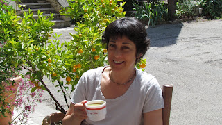
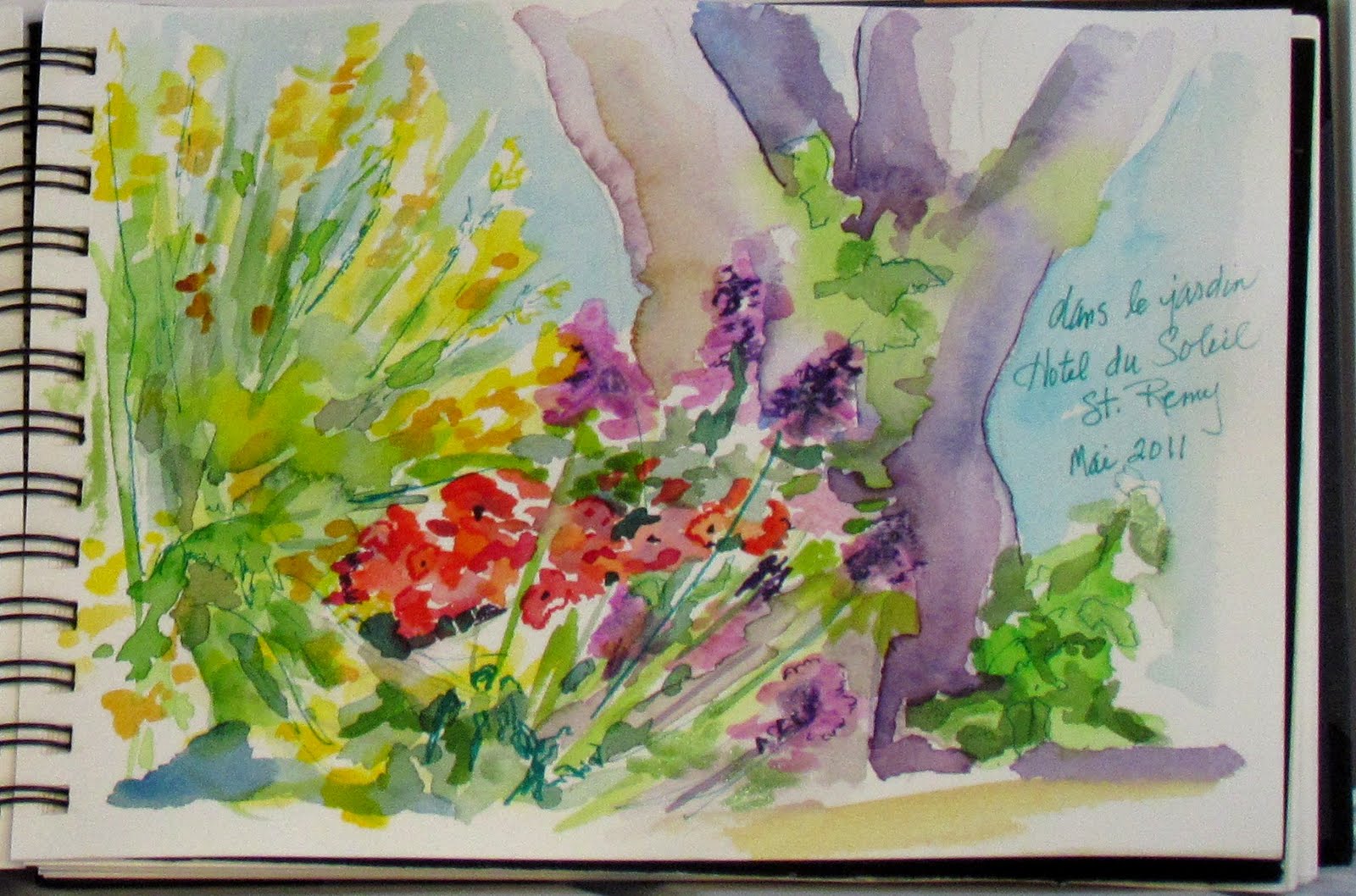
| First thing – Coffee! |
This day is absolutely gorgeous! Today we visited two of
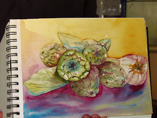
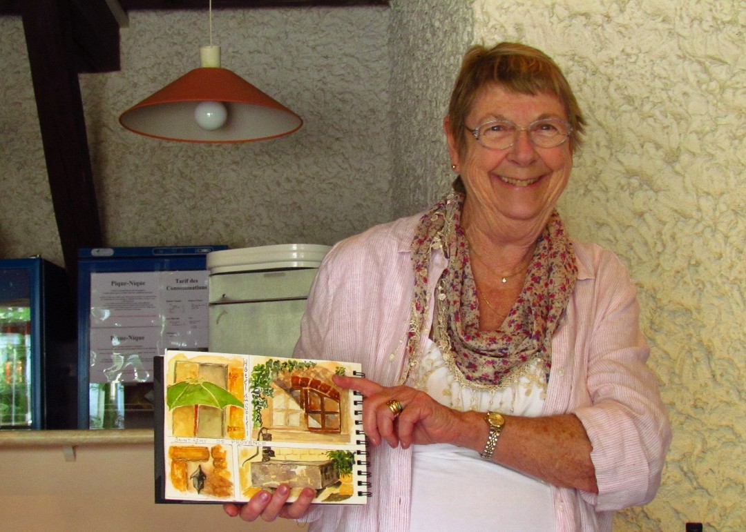
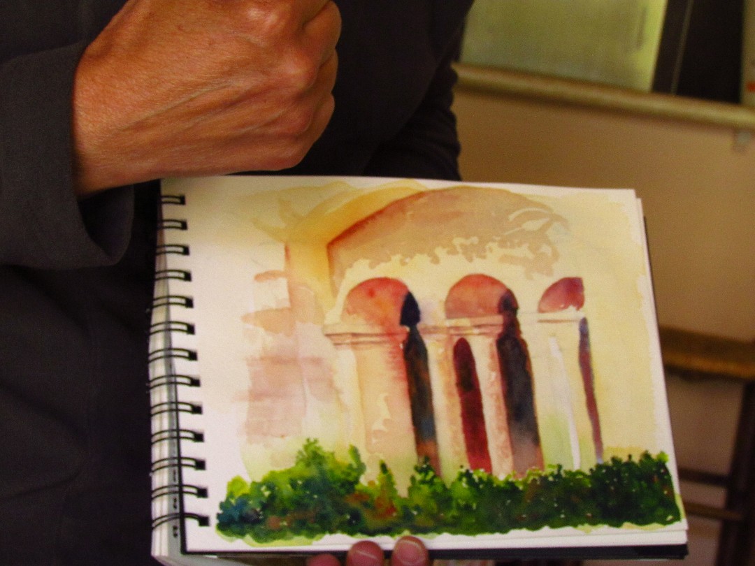
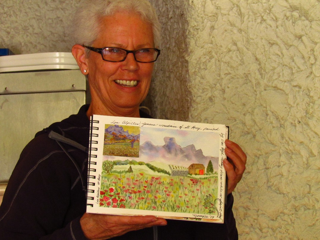
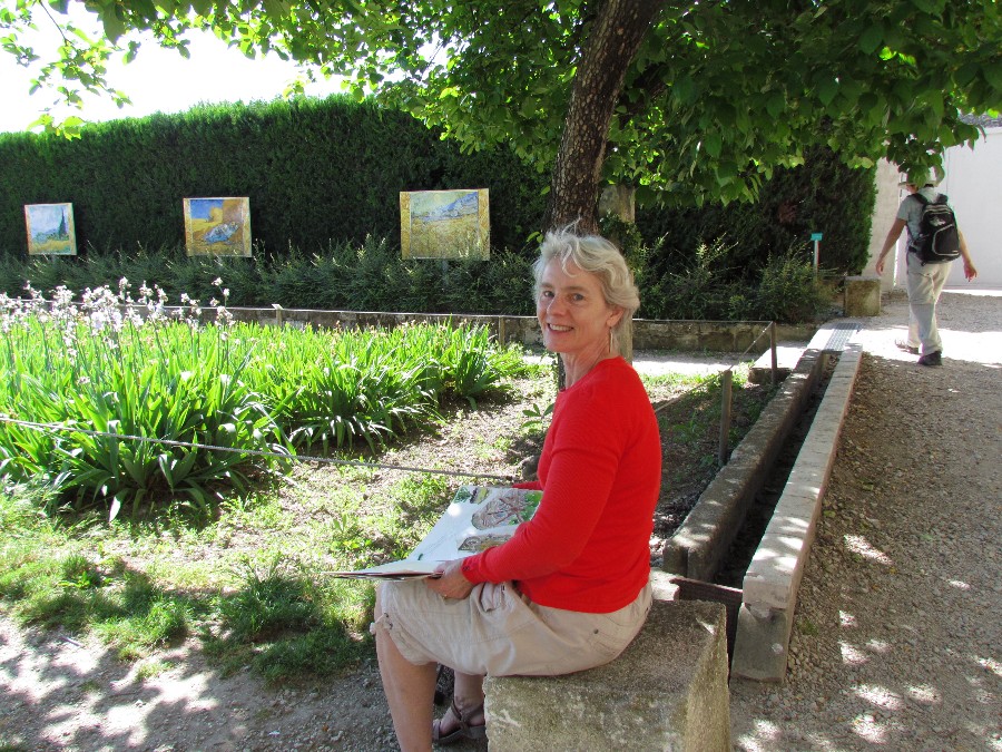
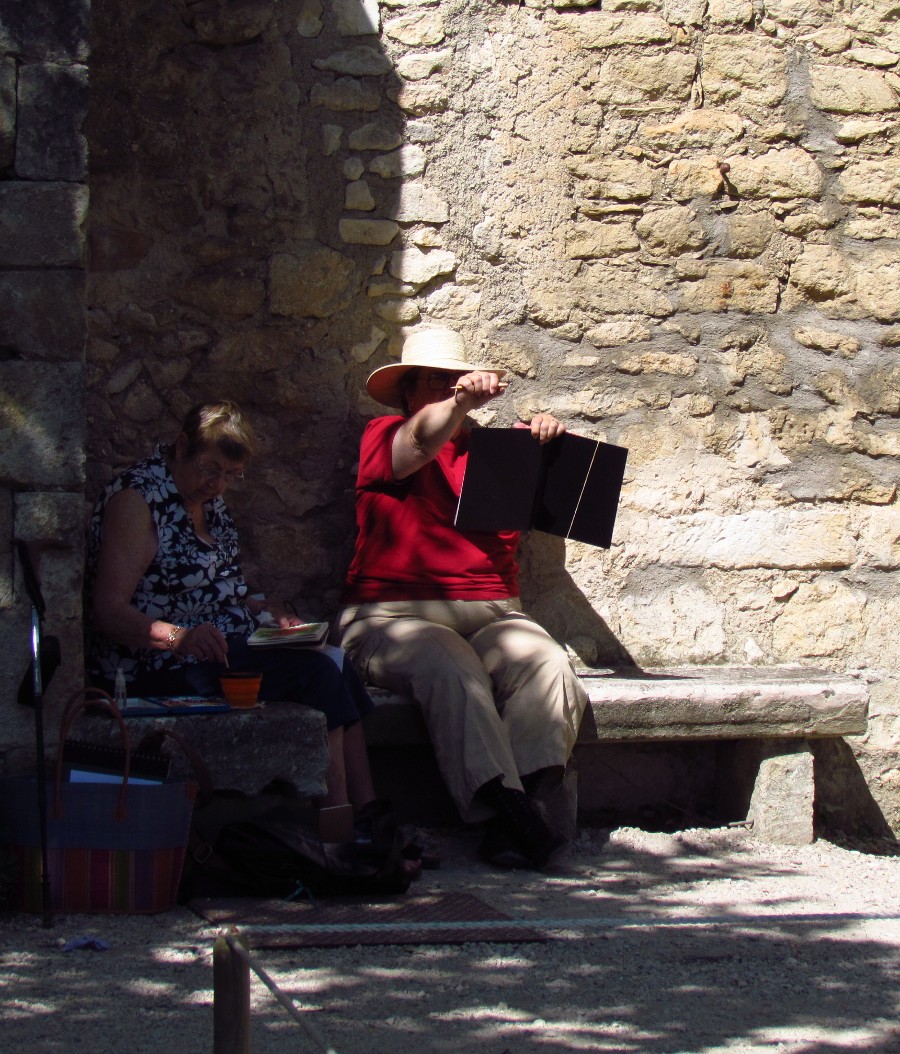
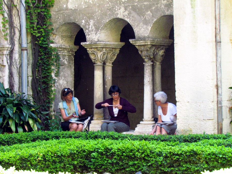
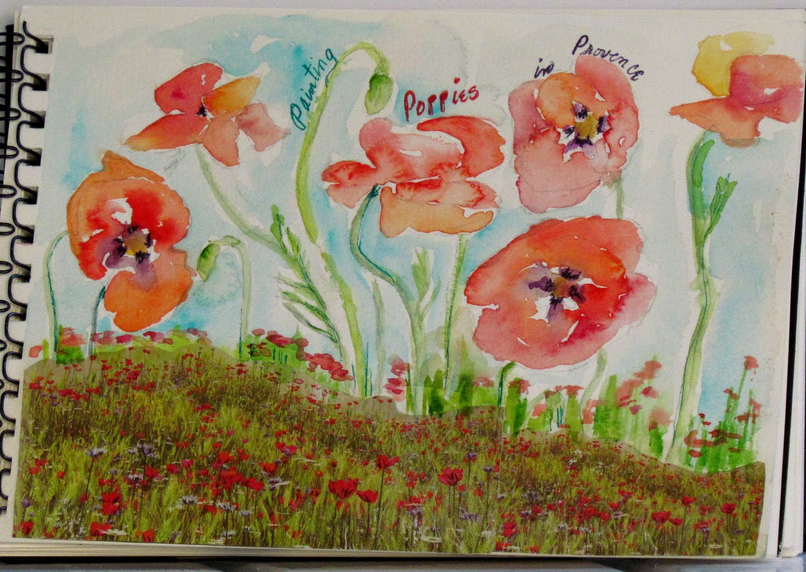
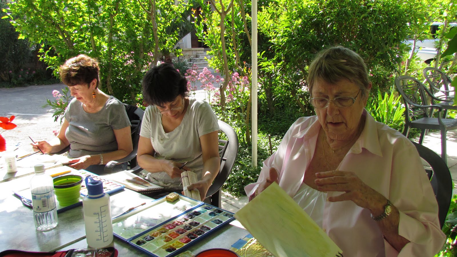
France’s Plus Beaux Village (most beautiful villages) of which there are 141. Before we left the hotel, I demo one of my favorite ways to do quick on-the-go painting sketches.
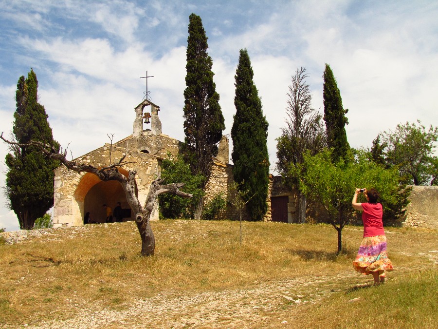
Our first stop was Gordes where we found a wonderful place to stop to take photos.
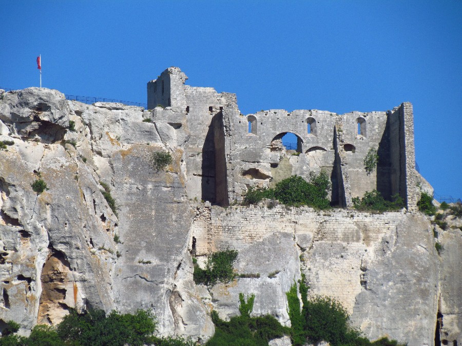
Gordes is a very beautiful old village, perched on the southern edge of the high Plateau de Vaucluse. The stone buildings built in tight against the base of the cliffs and those perched on the rocks above, including the 12th-century castle, are made of an beige stone that glows orange in the morning sun. The view from the village is a southern panorama out across fields and forests and small perched villages to the Montagne du Luberon.
Our first stop is the lavender factory. We learn about the different kinds of lavender.
 |
| We stop here to take photos of Gordes, one of France’s most beautiful village |
|
|
|
|
|
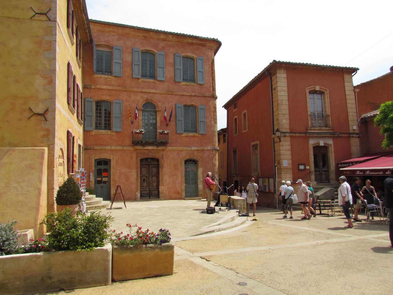
We arrive at Roussillon, famous for it’s red ochre with its red rocks, red stone buildings and red tile roofs. We spent several hours here painting.
 |
| Mary Ann, Kendra, Sharon, Helen and myself with Roussillon in the background |
We buy little jars of the mined local pigments. We also get gum Arabic so we can mix the powders to make our own watercolors. How cool is that!
 |
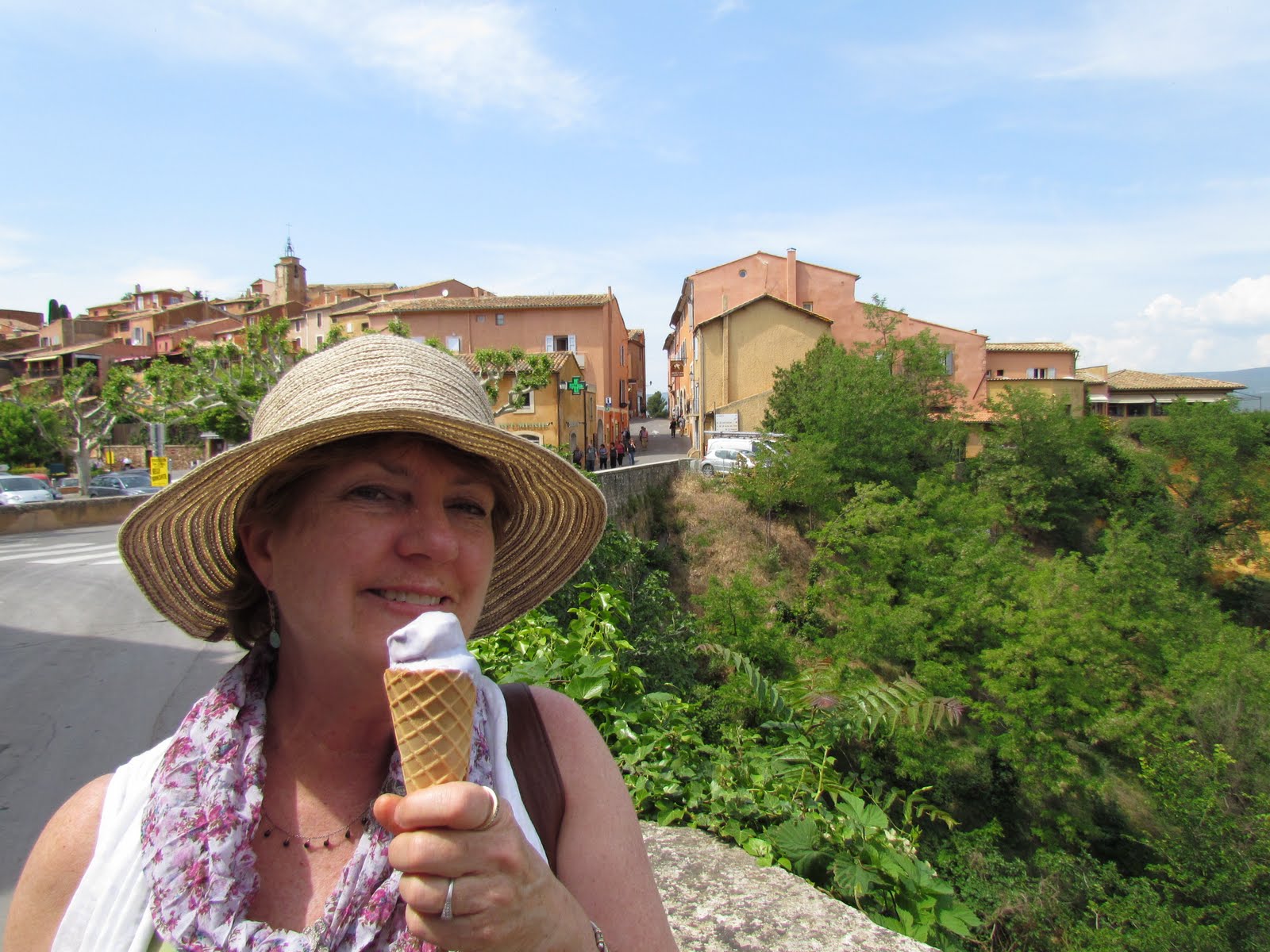
| I can not resist a “boule” of lavender ice cream! |
|
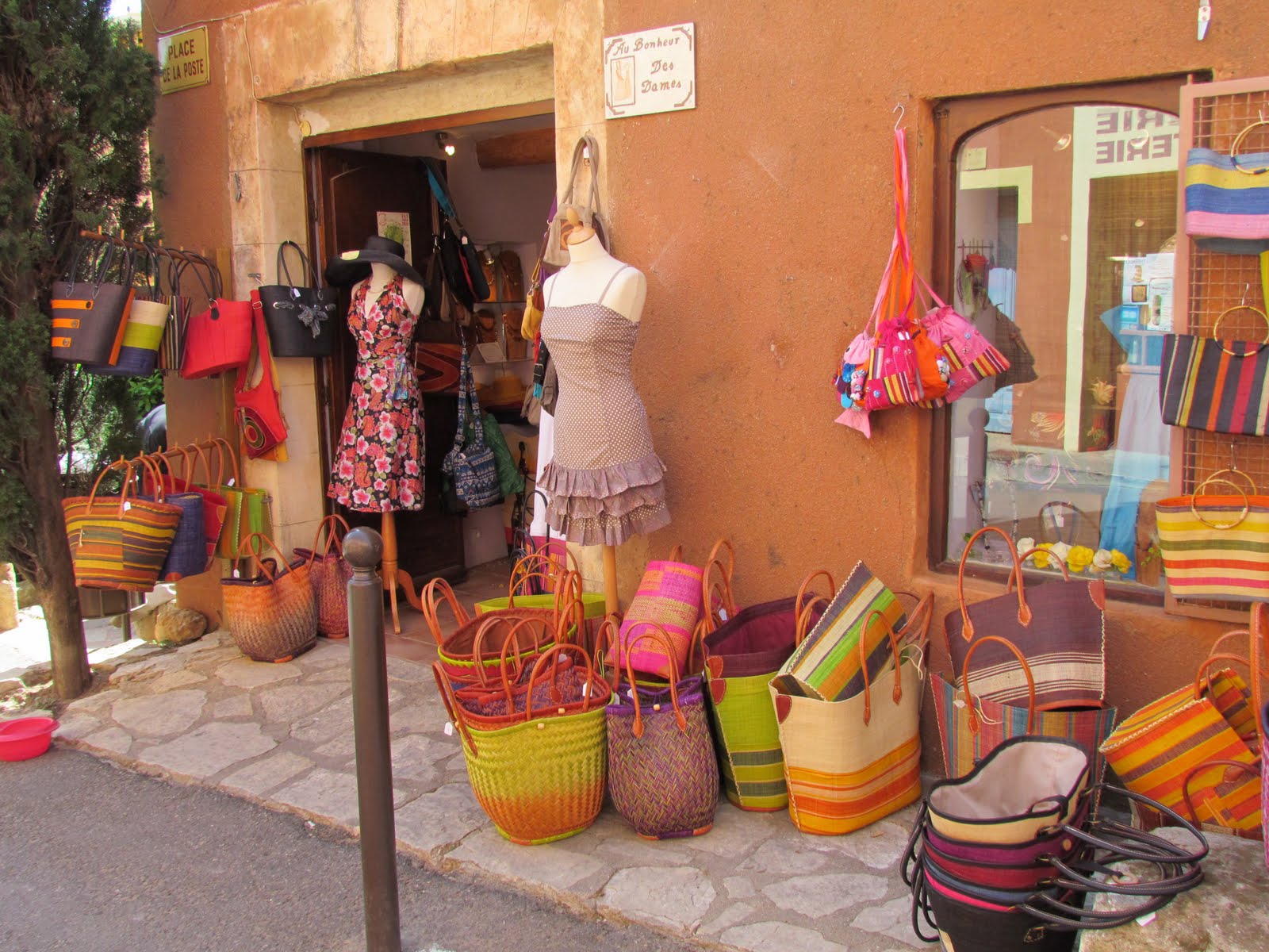
It is fun to see all the colorful baskets. Everything here has a glow of red that bounces off the stone walls. I feel like I could spend 100 days here painting!


