Artists Stocking Stuffer Ideas

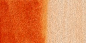
It is a rich, transparent color that mixes well with blues and reds or can be used on its own.
jonradio-remember-me domain was triggered too early. This is usually an indicator for some code in the plugin or theme running too early. Translations should be loaded at the init action or later. Please see Debugging in WordPress for more information. (This message was added in version 6.7.0.) in /var/www/wp-includes/functions.php on line 6114
It is a rich, transparent color that mixes well with blues and reds or can be used on its own.

Translucent Orange is considered a transparent color and has excellent lightfastnest meaning that it doesn’t fade over time. It is a great color for painting flowers!
“The word vermilion came from the Old French word vermeillon, which was derived from vermeil, from the Latin vermiculus, the diminutive of the Latin word vermis, or worm. The name originated because it had a similar color to the natural red dye made from an insect, the Kermes vermilio, which was widely used in Europe. The term cinnabar was used interchangeably with vermilion until the 17th century, when vermilion became the more common name. By the late 18th century ‘cinnabar’ applied to the unground natural mineral only.”
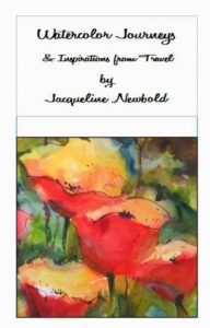
 “Wow! What a treasure! I love it! You need to expand on it and publish it big time! What a gorgeous book and filled with great information and beautiful artwork!” ….. Lynn
“I just wanted to follow up with you…I LOVEthe book, I have been pouring over it and working on the lessons – I feel like they should be called “workshops”, they have proven to be so productive and interesting for me. Your careful, organized, right-to-the-point explanations and ideas to try out the concepts (especially color mixing, love the chickens:-) has been very helpful, fillling in the holes in my watercolor education. I am having so much fun with it, and not feeling any of the tentativeness or anxiety around the outcome as I have in the past.” …..Jeanne
“Got the book today and I do indeed love it! I’ve already taken a couple of ideas from it for my travel journal [my palette and colour wheel] and will take your book to Italy with me.” …..Lori
“I received your book today, and absolutely LOVE it!!! So much so, that I just ordered 2 more, to go along with the additional copies of the DVDs that I purchased.” …..Cori
To order your copy, please click on the BUY NOW button to the right.![]()
I am very excited to present my watercolor workshop with Adventures in Italy Painting the Italian light and color! One of my favorite things to do is to teach how I create visual journals of my travels using watercolors. Orvieto, the charming Italian village perched on a rock, is the perfect place to spend our week together. We will enjoy colorful painting time, tasty food delights, wine tasting, exploring the rich culture and history of the area, shopping, and relaxing in the quiet gardens of our Italian home. Umbria is rich with sights, sounds, and colors – all wonderful inspiration for developing your artistic eye.
The wind, the bird flying away. The idea of god.
And it can keep you busy as anything else, and happier.
I write the name of the color and the manufacturer of the paint on the back side of the paper. Then I wet the front of the paper and paint it. I try to have lay the color on thick and thin to see how dark it can get. When it is dry I write the name of the paint on the front of the paper.
When I decide on a color, I start to lay the tubes of paint around my palette to see where they will go.