Browsed by
Category: Painting watercolor in Provence

Watercolor Painting In the Small Villages of Provence

Watercolor Painting In the Small Villages of Provence

Even though I have left the sunny, warm days of southern France and making my way home, I am still holding on to the essence of Provence.  I already miss the rich morning coffees, the happy faces of the students in the workshop, the lyrical “Bonjours”, the scent of lavender in the air and the friendly smiles of all we meet.  Our last couple of days of the workshop were spent in some very off-the-beaten tourist paths and quiet painting sites.
 
This morning, instead of my brisk walk to St. Remy de Provence for a fresh baguette, I drove down a six lane highway in search of a good cup of coffee.  I am currently in Poughkeepsie, New York for a very special event.  My oldest daughter is graduating from Vassar College tomorrow and I have joined my family here to celebrate this joyous occasion.  It is always bittersweet to leave France!

Having fun exporing mixed media journaling

Painting in the quite hilltop village of Egalieres

Looking towards Les Alpilles

A friendly guy takes our photo and cleverly gets in it too

The cute Roman chapel, St. Sixte, built in the 12th Century

Very cozy French restaurant, La Pitchoune

Cheese!

Painting in a vineyard with an beautiful backdrop
Color, Color, Color Everywhere! Color Confessions of a Traveling Artist, Part II

Color, Color, Color Everywhere! Color Confessions of a Traveling Artist, Part II

OK, this is the part I agonize over even more than the choice which palette to take on my travels (see part I).  There are only an limited amount of watercolor wells on any given palette.  So which lucky colors will get to go with me to France?

First I start with a warm and a cool of each of the primary colors.  Here are my thoughts, starting with the yellows.  Hansa yellow medium, of course, because it is a cool yellow and plays well with cobalt and cerulean blue for great greens.  It replaced Aureolin on my palette years ago because it is not fugitive.  My warm yellow of choice is always New Gamboge.   My cool red is Permanent Rose and the cool blue is Cerulean.  My warm red is Winsor Red and the cool blue is Winsor or Phthalo blue.  Here I run into my first delimma – should I include French Ultramarine or not.  It is suppose to be the warmest of all the blues which intrigues me but I think it looks a lot like cobalt blue.  It does make great darks but then so does Phthalo blue.  It has bounced back a forth from being on my palette and then getting ousted.  Sad day for French Ultramarine Blue – it stays behind!

Which colors are always on your palette?  If you were stranded on an island, which colors would you absolutely have to have?  These are the six that I could not live without!

The Creative Process, A Peak inside my Empty Watercolor Journal

The Creative Process, A Peak inside my Empty Watercolor Journal

Do you enjoy the anticipation of an upcoming vacation or trip?  Do you practice packing your suitcase with your favorite clothes?  To me the journey begins way before walking out the door, suitcase in hand.  I love preparing my art supplies for my travels.  Planning for my upcoming trip, Painting Poppies in Provence, France, I decided to take two watercolor journals.  (Two spots just opened up on this trip to Provence, so let me know if you want to join us!) One is a 14 x 10 Arches Watercolor Book with 140 pound Arches paper.  The other smaller one is a Strathmore 400 Field Watercolor Sketchbook.  For years I have had a love/hate relationship with the Strathmore field book.  Every other piece of (crappy) watercolor page alternates with a piece of drawing paper.  This drawing paper is where my mixed-media imagination soars and I have probably filled at least 10 of these journals with art from my travels.

Pages in my journal prepared for the trip

First page in my new journal with inspiring quote.

Well, this year I decided to quit complaining about the (crappy) watercolor paper and tore my Strathmore Sketchbook apart.  I kept the metal coil and the black hard covers.  I  filled it with Arches 140 paper alternating with Strathmore 400 series drawing paper.  I prepared the drawing papers with colorful backgrounds and finished the first page with an inspiring quote for my upcoming trip: “To Paint…. to travel…. the combine the two is to celebrate life”  (Jack Brouwer). 

The cover of my new “Strathmore” journal now filled with Arches watercolor paper!

Stay tuned for my upcoming article in Cloth, Paper, Scissors magazine’s special edition, PAGES, on how to prepare these your jouranl pages with mixed-media and watercolor.
How do you prepare for your upcoming journeys?  I would love to hear what special techniques and ideas you have!

Featured Artist at the Red Chair Gallery

Featured Artist at the Red Chair Gallery

This is me (Jacqueline) in front of my new paintings.

Art Hop night in Bend, Oregon was a fun event.  It was our first warm day in months and downtown Bend was the place to be! I was honored to be the Featured Artist for the Red Chair Gallery, located on the corner of Bond and Oregon Street in the historic O’Kane building.  My paintings will be up for the month of April.

Sucessful Paintings!

Sucessful Paintings!

Here’s to successful paintings!

We have just finished up the Painting from Start to Finish Workshop held at my studio.  We looked over some of our paintings during our “happy hour critique” at the last class.
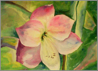
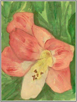
Our warm-up exercise for this last class was to paint a lily using lost and found or soft edges.  I think they turned out wonderfully!

Here are some of the paintings that we worked on:

Jan’s Landscape

Kendra’s Moroccan Alley

Barbara’s Adobe

Rocks and Indian Paintbrush by Mary Anne

Sue’s colorful Mountain Sunrise
Happy Painters

Talking about the process

Fun With Brush Strokes – Impressions of a Landscape Painting

Fun With Brush Strokes – Impressions of a Landscape Painting

Quick 5 minute study of a landscape

As I get ready to teach my For Beginners Only Class, I am having fun remember the joy of discovering what your brush can do on the watercolor paper.  It is so exciting to watch the colors mingle and combine to create new and unplanned colors.  Why not have fun before you sit down to some serious painting.
Pick 3 colors (I used Cerulean Blue, Quinacridone Sienna and Nickel Azo Yellow).  Start with the blue at the top for a impressionistic landscape.  Switch to sienna and then yellow as you near the bottom.  Before the painting starts to dry,  mix the yellow and blue for some greenery.  As you paint, play with your brush to see how many different types of strokes you can make: soft edges, hard edges, dry brush strokes, flicks, splatters, twirls….. Just play and don’t worry about what the painting will look like. 
I would love to hear back from you….Let me know if this was a fun thing to do!

More from our Travel Watercolor Journals, Provence, France. How to use paper napkins in your journal.

More from our Travel Watercolor Journals, Provence, France. How to use paper napkins in your journal.

Journal Page from on of my student’s watercolor journal

Are you an artist?  Do you love to paint on location?   The group of ladies that I took to Provence, France found that the more we painted the better we got.  No surprise, right?  Well it is so much easier when you have devoted a time to paint everyday and with a people that want to paint together.
One of the fun things we did was to search the little French shops for dinner napkins.  I found some that were a replica of Vincent Van Gogh’s poppy painting.

Here is how to use them as a starting point on a journaling page:

1.  Most napkins are made up of 3 very thin layers.  Peel them apart and glue the top one with the design on it on a page in your journal.  I used mat medium.  I painted it under and on the top of the napkin.
2.  Using the design as a guide, paint a similar design out past the napkin.  Take clues from the colors and shapes found on the napkin.
3.  Below is a page from one of my travel journals and shows how I used napkins to create a travel collage.  Can you guess which parts are the napkin?

Jacqueline’s Journal Page

We have room for a couple more artists to join us on our May 9-19, 2011 trip to Provence, France.  Would you like to join us?  Email me if you are interested.

Painting on location – Provence, France

Painting on location – Provence, France

I thought it would be fun to share some of the art from the participants that went to Provence with me, September 2009.  Everyday we would go out on location to paint.  We would often finish up our paintings at our hotel, le Hotel du Soleil.

This is Mary Anne’s beautiful painting of Daudet’s Windmill near Fontvieille

The lesson for this day was about how to create volume and how to make something look round.  I think that Mary Anne did a wonderful job!

Below is Irene’s interpretation of the women who do the traditional dance of Provence.  I love her choice of colors.  She really captured the beautiful dresses the women used to wear. 

Page from Irene’s journal – Traditional Dance Attire of the Women of Provence
The Chickens are Back!

The Chickens are Back!

Ethyl’s Home

My chickens see me coming from across the yard, with my food pail in my hand.  They come running in hopes that I have something very special in there or perhaps they want to be the first to the goodies.  If Ethyl or any of them ever get out of their little pen, this is a good way to get them back again. 
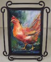
I have been having fun painting miniature paintings of my chickens giving them lots of color and life.  These paintings will be available for purchase starting on Friday for the First Friday Art Walk at the Birkenstock store and the Red Chair Gallery, December 4, 2010.  Hope you will come in and let me know what you think.

Making Plans for Painting in Provence, May 2011

Making Plans for Painting in Provence, May 2011

I met with Helen yesterday about our upcoming May 9-19 trip to Provence, France.  I am getting so excited about it that I can’t sleep past 4:30 in the morning.   We will be visiting  Roussillon know for it’s red-ochre colors and designated one of the most beautiful villages in France.  Here is a photo that I took when I was there with my family in 2003.  This photo is inspiring me to get to my studio today to paint!  Daniel Smith Art Supplies has a color I haven’t tried yet – Burgundy Red Ochre.  Described as a granulating, reddish-brown earth color, it sounds perfect for trying to capture the ruby glow of Roussillon.  They also have free shipping, so now is a good time to stock up on supplies if you need anything.