Browsed by
Category: journal

Here is a Fun Warm-up Exercise

Here is a Fun Warm-up Exercise

Here is the post that I did for this month’s Sketchbook challenge.
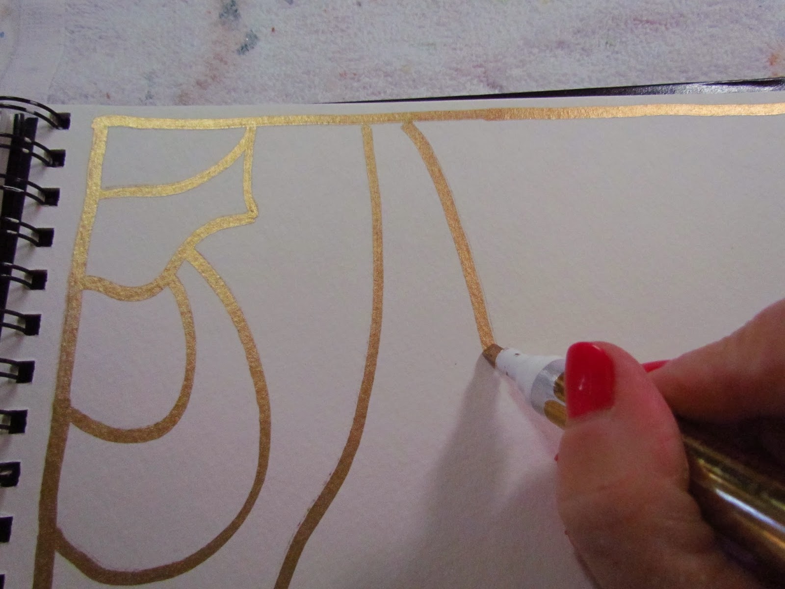
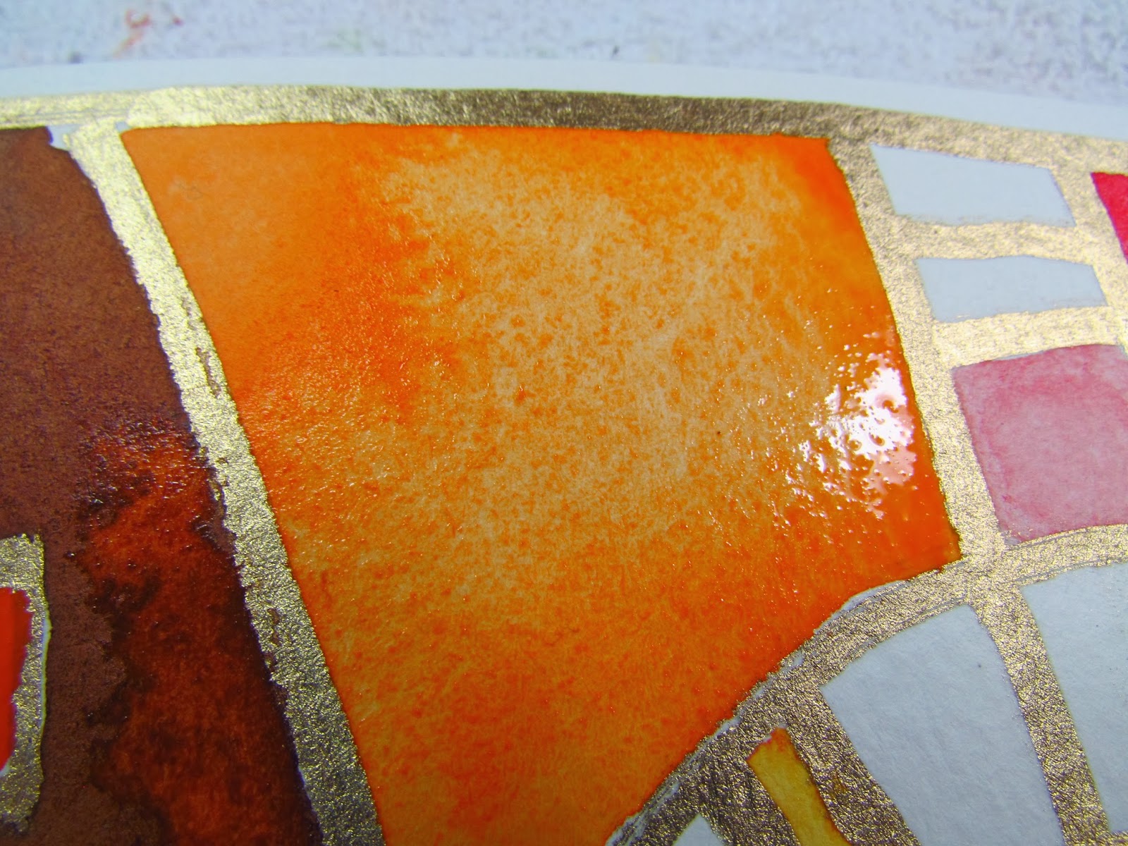
Warm and cool colors are something that I think about all the time in my painting and enjoy playing warm colors against cool colors to create vibrate and dynamic watercolors.  Here is a fun exercise that you could do with warm colors or cool colors – your choice!  I did mine with warm colors.  You will need your watercolor paints, watercolor brushes and a Gold Leaf Pen for this exercise.
Start by drawing big shapes in your journal with the gold leaf pen.  I drew my initials JN.  Make sure you go off the page here and there.

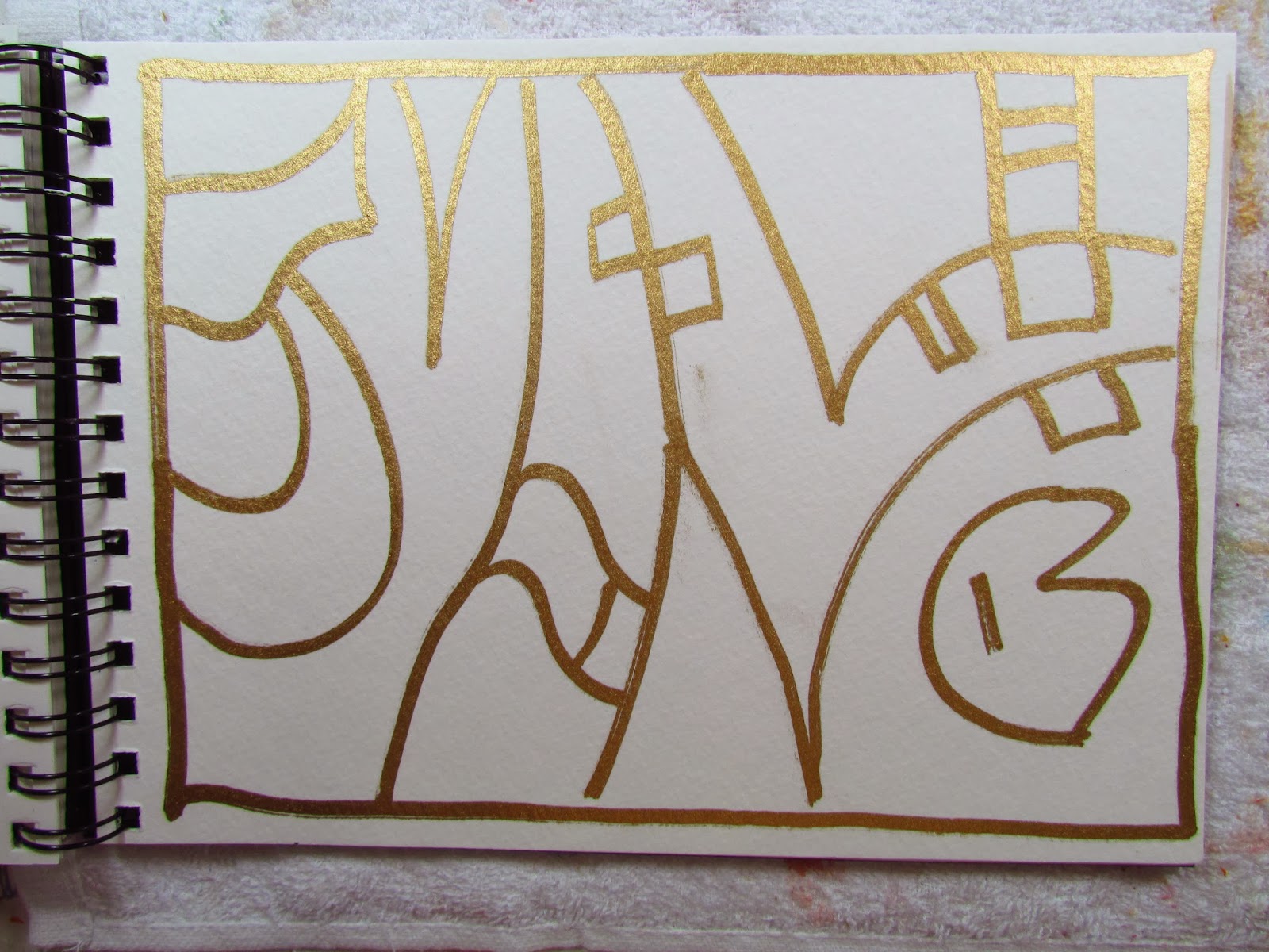
 Then add smaller shapes within your large initials.

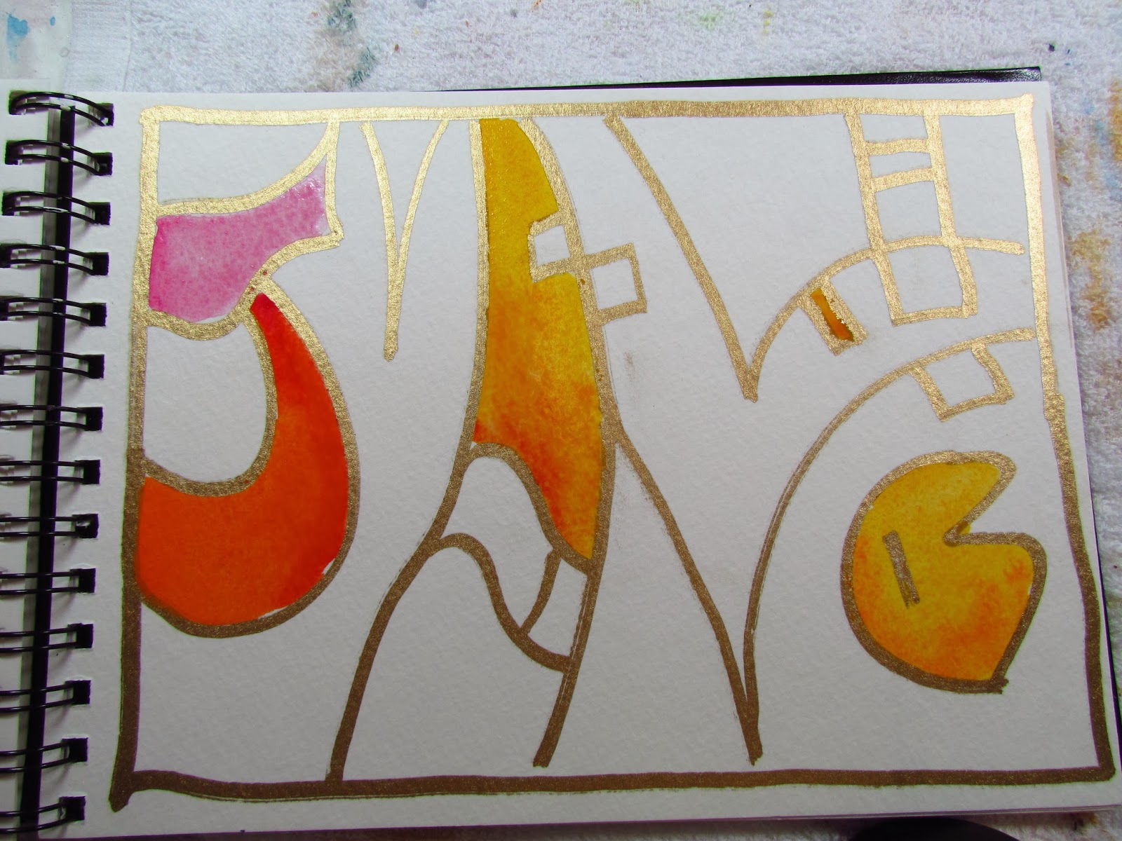
 Pick a color scheme warm or cool.  I chose a warm palette so I painted all my shapes with yellows, oranges, reds and combinations of these colors. The gold leaf pen lines will act as a resist to the paint.

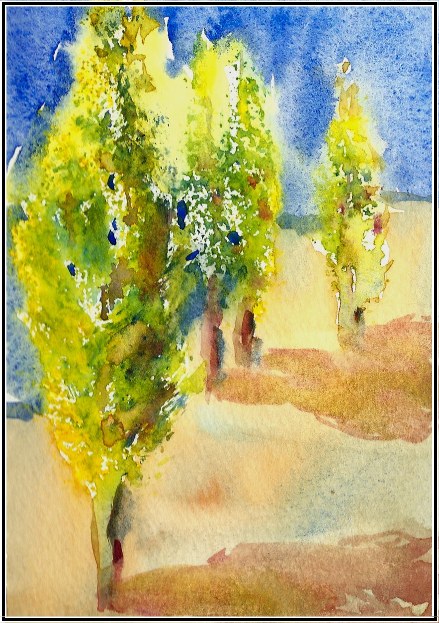
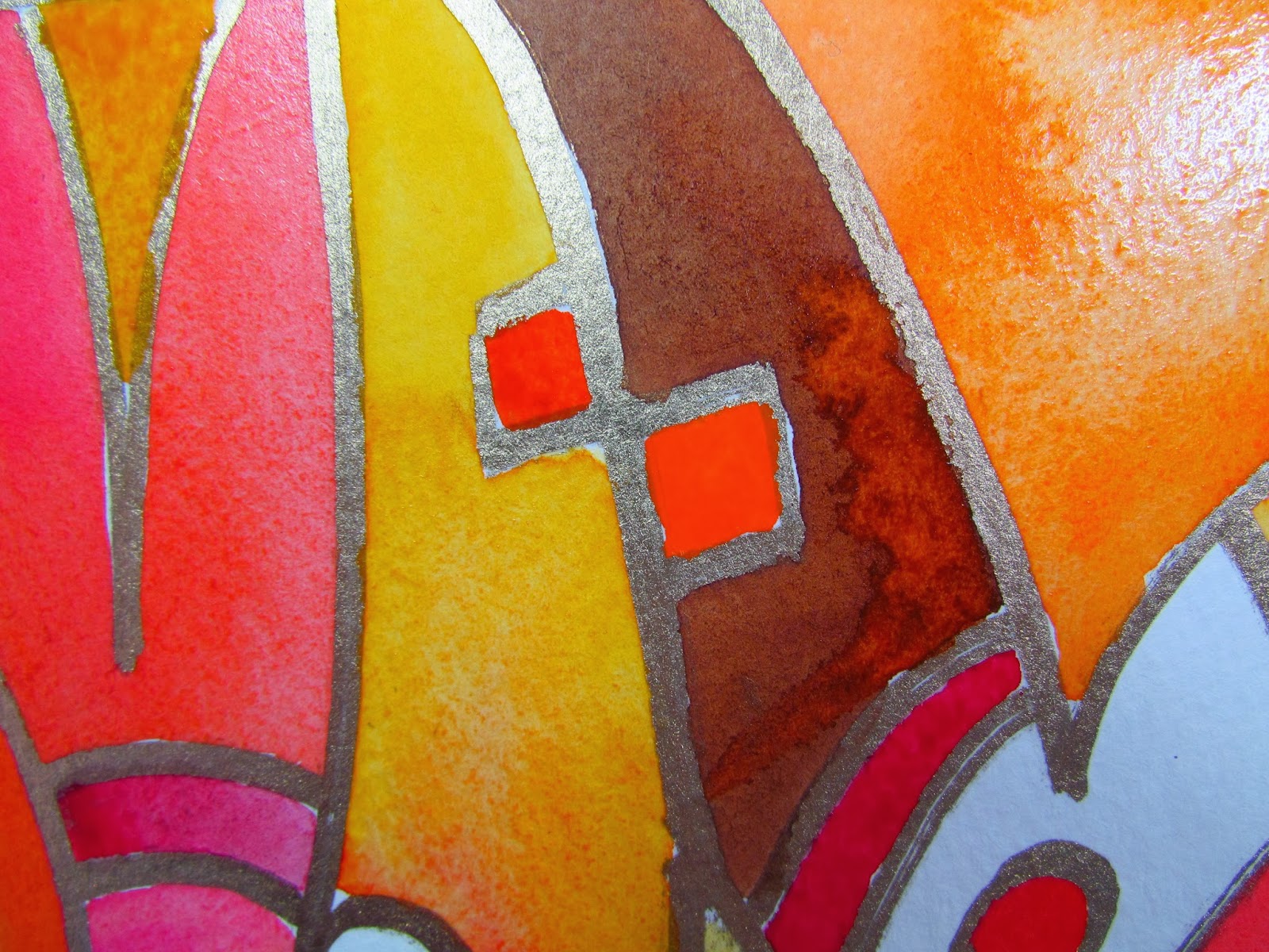
This is my final page in my watercolor journal

Check out my Daniel Smith Watercolor Kit for great deal on watercolor paints.  If you are just getting started, this is the kit for you!  

The Creative Process, A Peak inside my Empty Watercolor Journal

The Creative Process, A Peak inside my Empty Watercolor Journal

Do you enjoy the anticipation of an upcoming vacation or trip?  Do you practice packing your suitcase with your favorite clothes?  To me the journey begins way before walking out the door, suitcase in hand.  I love preparing my art supplies for my travels.  Planning for my upcoming trip, Painting Poppies in Provence, France, I decided to take two watercolor journals.  (Two spots just opened up on this trip to Provence, so let me know if you want to join us!) One is a 14 x 10 Arches Watercolor Book with 140 pound Arches paper.  The other smaller one is a Strathmore 400 Field Watercolor Sketchbook.  For years I have had a love/hate relationship with the Strathmore field book.  Every other piece of (crappy) watercolor page alternates with a piece of drawing paper.  This drawing paper is where my mixed-media imagination soars and I have probably filled at least 10 of these journals with art from my travels.

Pages in my journal prepared for the trip

First page in my new journal with inspiring quote.

Well, this year I decided to quit complaining about the (crappy) watercolor paper and tore my Strathmore Sketchbook apart.  I kept the metal coil and the black hard covers.  I  filled it with Arches 140 paper alternating with Strathmore 400 series drawing paper.  I prepared the drawing papers with colorful backgrounds and finished the first page with an inspiring quote for my upcoming trip: “To Paint…. to travel…. the combine the two is to celebrate life”  (Jack Brouwer). 

The cover of my new “Strathmore” journal now filled with Arches watercolor paper!

Stay tuned for my upcoming article in Cloth, Paper, Scissors magazine’s special edition, PAGES, on how to prepare these your jouranl pages with mixed-media and watercolor.
How do you prepare for your upcoming journeys?  I would love to hear what special techniques and ideas you have!

Capturing the Colors of Greece

Capturing the Colors of Greece

Red Roofed Church, Ano Syros, Greece

Part of the joy of painting on location on the island of Syros, Greece is to recreate the reflecting colors of the cobalt blue sky, turquoise ocean and the warmth of the sunshine on the white buildings.  Our watercolor journaling class will learn how to paint colorful whites using the local colors.

An easy way to paint a beautiful white is called Wet into Wet painting.  Wet the area you want to appear white with clear water.  Add enough water for the paper to be wet and shiny but not enough to make a puddle.  Then drop in little amounts of paint and let the water carry the paint around.  In this painting I picked the blue of the sky, the reds from the church roof and a little yellow to create the feeling of the warm sun shining on the white walls of the town.
If you are interested in signing up for this Watercolor Journaling in Greece Class, please visit the American College of Healthcare Science.
Part I: Paint a Tree using Watercolor and a Sea Sponge:

Part I: Paint a Tree using Watercolor and a Sea Sponge:

Everyone in my watercolor class really enjoyed this easy way to paint a tree so I thought it would be fun to share this idea with you!
I use very little water and a good sea sponge with lots of character.

  • First, take a spray bottle and spritz your watercolor paints on you palette.  
  • Get the sponge wet but squeeze out all the water and then dip it directly into the moisten paint.  I dip it first into cobalt blue then into Hansa yellow so that both colors are on the sponge.    
  • Starting at the top of the tree, dab the sponge on your watercolor paper, working your way down and making a tree shape such as a poplar or aspen tree.  Create a light side and a darker side to the tree.  
  • Before this dries, add a trunk and branches to connect some of the dabbed area.
  • Practice making more trees in the distance behind this first tree.  Let dry.
  • Tomorrow I will blog about adding the sky and background.   Please check back!

I would love to hear how this works for you! Also, I am thinking we should look for some sea sponges during our watercolor journaling class in Greece

Fun With Brush Strokes – Impressions of a Landscape Painting

Fun With Brush Strokes – Impressions of a Landscape Painting

Quick 5 minute study of a landscape

As I get ready to teach my For Beginners Only Class, I am having fun remember the joy of discovering what your brush can do on the watercolor paper.  It is so exciting to watch the colors mingle and combine to create new and unplanned colors.  Why not have fun before you sit down to some serious painting.
Pick 3 colors (I used Cerulean Blue, Quinacridone Sienna and Nickel Azo Yellow).  Start with the blue at the top for a impressionistic landscape.  Switch to sienna and then yellow as you near the bottom.  Before the painting starts to dry,  mix the yellow and blue for some greenery.  As you paint, play with your brush to see how many different types of strokes you can make: soft edges, hard edges, dry brush strokes, flicks, splatters, twirls….. Just play and don’t worry about what the painting will look like. 
I would love to hear back from you….Let me know if this was a fun thing to do!

Watercolor Vignettes from Ponet; a Peek inside my Watercolor Journal

Watercolor Vignettes from Ponet; a Peek inside my Watercolor Journal

Inspired by my blogger friend, Laure and her thoughts on using different formats, I thought I would share this page from my Provence, 2009 Watercolor Journal. 
Directions:  using artist tape, tape off some shapes on a watercolor page in your journal.  Paint a watercolor wash.  Here I used an analogous mix of yellows, greens and blues.  Draw in some little vignette drawings.  Then add some more color to increase the value in certain areas.  Pull off the tape and journal in the white areas. 
Be sure to check out Laure’s wonderful painting of a Canadian Goose using a long format!

Demonstration at Bend’s Fall Art Hop: October 1, 2010

Demonstration at Bend’s Fall Art Hop: October 1, 2010

What a beautiful evening it is going to be in Bend.  The weather is warm but autumn is in the air and the trees are showing their fall colors.  I am packing my car with new paintings, prints, cards and new jewelry and a few supplies to set up a watercolor demonstration at the Birkenstock Store.  I will have some examples of what I will be teaching in my upcoming class at Central Oregon’s Art Central.  Come by and see what is new!